Rastin Rastgoufard, Ph.D.
Unocity Innovations Inc
November 22, 2021
Those of you who know me likely saw a number of posts I made just before Ida knocked out power at the end of August. It was my first time publicly making predictions, an event that would have been very scary for me had HurrD not existed. This post will analyze those predictions and compare them to the reality that actually played out.
HurrD's models matched Entergy's live outage maps very closely. Furthermore, HurrD's predictions from 68 hours before landfall were 82% similar to what ended up happening 22 hours after landfall. That's a prediction lead time totaling 90 hours. Let's get into it.
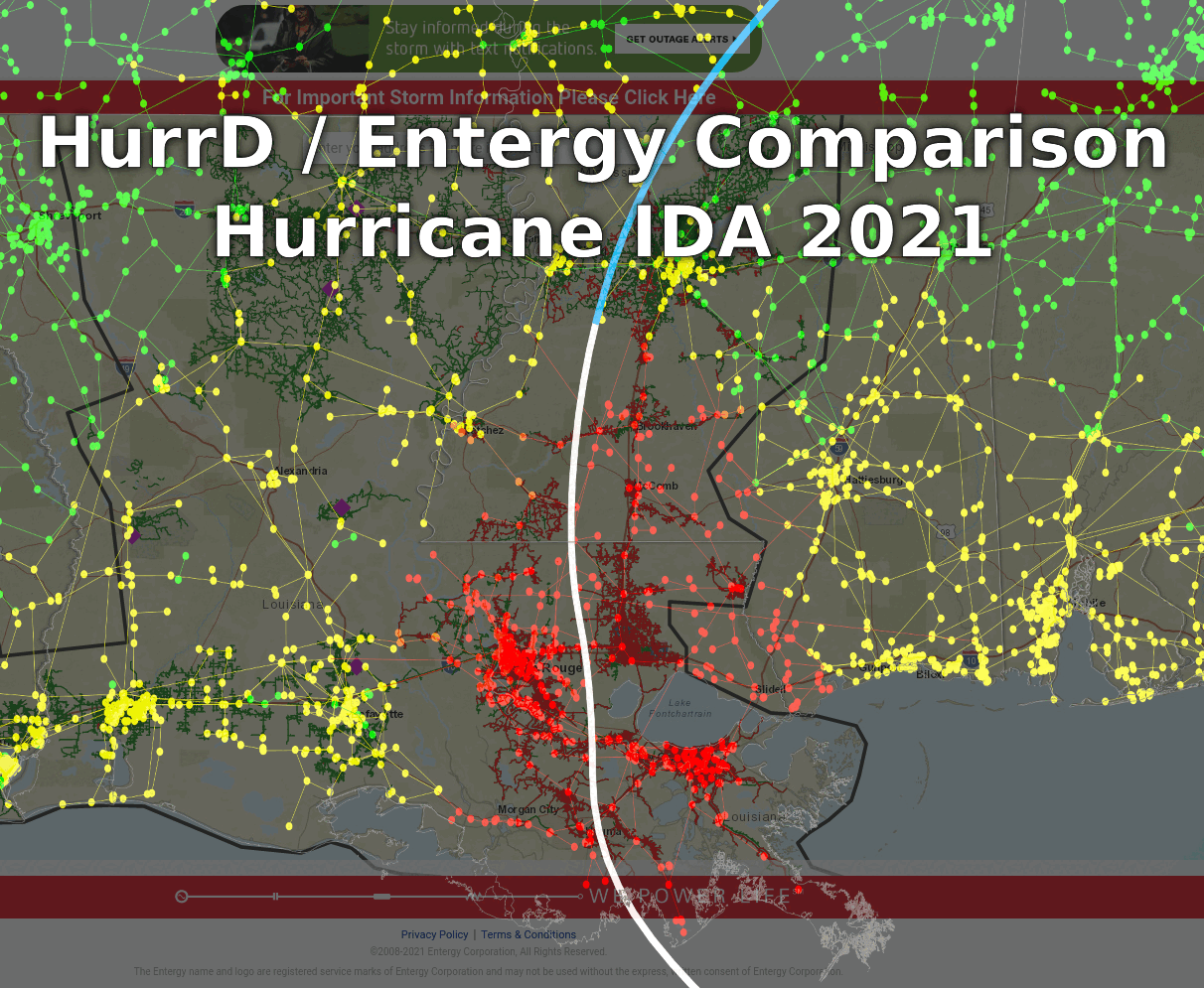
If you look at Entergy's current outage map, you would see the street of my house indicated by a nice green line segment. You would see the neighboring block also, as well as the cross street and all other branching streets. All green, of course, because there are no power outages currently.
The level of detail that is present in Entergy's outage map is possible because Entergy is displaying the Distribution portion of the electrical grid. Connecting various pockets of neighborhoods and cities together is the Transmission portion of the electrical grid. Transmission is much like highways and interstates whereas Distribution is purely the local streets.
HurrD uses the Transmission network in its modeling and calculations. When a storm passes through, if a transmission line goes down, then the pieces of the distribution network that depend on that transmission line will lose power. The converse is not true, however -- if some number of distribution lines go down, the transmission lines might still be fine.
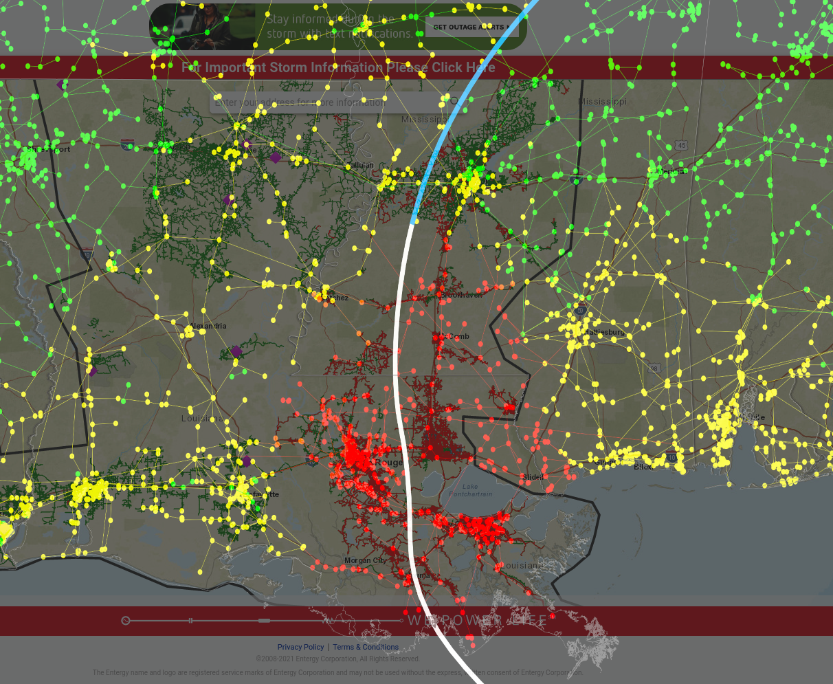
The image in this section shows an overlay of Louisiana's grid as seen by HurrD as well as by Entergy. The Entergy map shows a lot of detail as expected, and HurrD's overlay shows the transmission lines that it has in its model. Note that population density and transmission line density are very correlated.
The green, yellow, orange, and red colors are an indication of the state of the electrical system when hurricane Ida was just dissipating at 4pm on August 30, 2021. For Entergy's map, green means power is normal and red means power is disconnected. For HurrD's map, red means high probability of power outage, orange is a medium probability, yellow is light probability, and green is almost no probability of power outage. (The thick white line shows Ida's actual trajectory, and the blue line is where Ida is forecasted to go, meaning that the boundary is the latest location of Ida's center. Thick black lines indicate the boundaries of Entergy's service territory -- note that HurrD's model extends beyond.)
When overlaying HurrD's modeled outages on top of Entergy's actual outage map during Ida, it is clear that HurrD's model is incredibly performant despite using only the Transmission network in its calculations. The scope and extent of real outages lines up very well with what is modeled to have high outage probability. New Orleans and Baton Rouge are solid red in both reality and in HurrD's model. The red area extends north to just below the southern edge of Jackson. And going west, the red area stops just shy of Lafayette in both Entergy's map and HurrD's model. (For an animated view, see the splash image at the top of this article that compares HurrD and Entergy.)
HurrD's outage modeling is very accurate given that it knows where a storm has passed. However, this is never the case in a dynamically-updated live setting where the only available information contains storm forecasts because the storm has not yet happened! The next two sections will analyze the effect of using continuously-changing forecasts in HurrD's modeling in order to obtain outage predictions.
We have seen in a previous article titled Quantifying Accuracy in Hurricane Forecasts how accurate NOAA's hurricane forecasts have been historically. By my estimation, their forecasts were extremely good for this year's Ida, and hopefully with newer models, more computation power, and more sensory data, NOAA's prediction accuracy will continue to improve.
The animated sequence of images in this section shows the evolution of Ida's forecast track as well as the set of outage probabilities across the transmission grid as predicted by HurrD. There are 18 forecast advisories in total, each approximately six hours apart, beginning with Advisory #1 at 10am on August 26 -- 74 hours before the storm made landfall. Ida made landfall around noon on August 29 in between Advisories #14 and #15. It dissipated (was no longer considered a tropical storm) and therefore had no more advisories after 10am on August 30 corresponding to the final Advisory #18 at 22 hours past landfall.
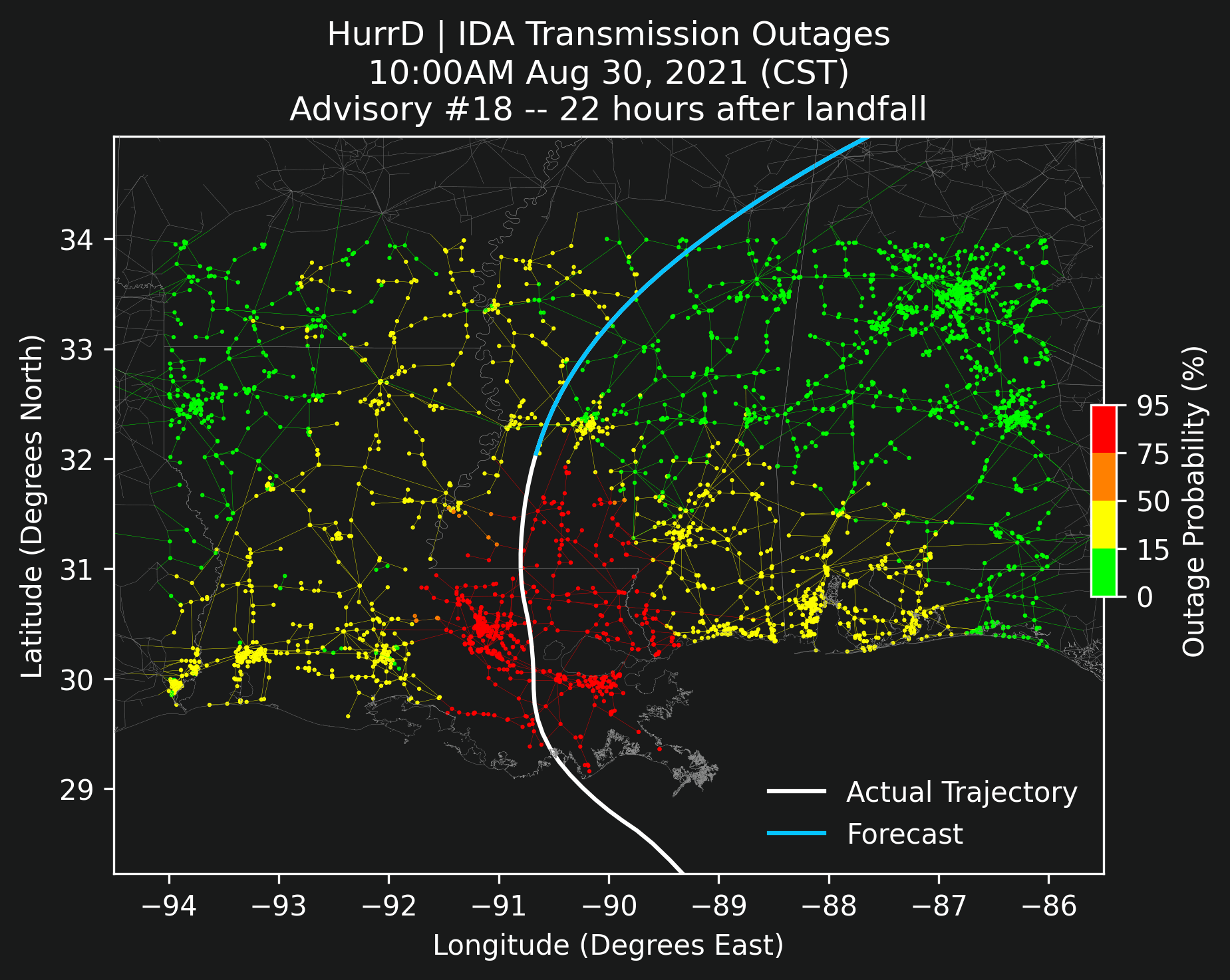
The center lines of Ida's forecast trajectories shifted approximately one degree between Advisory #2 and the final real outcome depicted in Advisories #16, #17, and #18. The one degree shift had the storm originally forecast to strike the western side of Baton Rouge, but it ended up shifting east and passing just east of Baton Rouge.
Despite the shift of one degree throughout the evolution of the storm, the red areas on the map did not change significantly. Baton Rouge was solid red the entire time, and New Orleans was primarily red with a couple glimpses of yellow as the track forecast oscillated.
The animation in this section provides an insightful visual representation of the evolution of the forecast updates as well as how those forecasts affected outage predictions. But the visual is lacking a concrete metric that can be used to compare forecasts against the final reality. The next section will discuss such a metric.
Similarity in this context is a measure between two forecast advisories and provides a score of how close those advisories' predicted outages would be according to HurrD. The metric compares the set of all outage predictions caused by the track in Advisory A against the set of all outage predictions caused by Advisory B. Ideally, measuring A-vs-B would give the same result as B-vs-A, and measuring A-vs-A against itself would result in perfect similarity.
An appropriate measure for our use case is the weighted Jaccard index with details on Wikipedia that applies to sets of elements where each element can be weighted. The elements in our case are the transmission lines and their weights are HurrD's outage probabilities given a specific advisory. The notation J(A,B) results in a concrete number that provides the similarity between Advisory A and Advisory B.
Since there are 18 advisories for Ida, there are 18*18 = 324 possible pairs for measuring J(A,B). However, since J(A,B) is equal to J(B,A), we can safely ignore half of those. Furthermore, J(A,A) is always perfect similarity, and so we ignore those too.
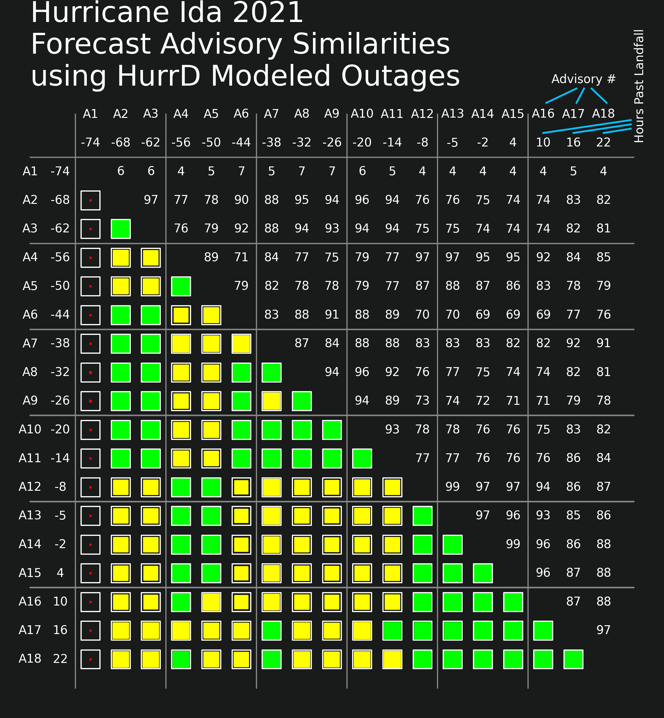
The image in this section provides a table that includes all valid combinations of similarities between the 18 advisories and displays both a numerical value for J(A,B) as well as a small graphical representation that quickly displays the similarity score.
The numerical values are scaled so that 100 is a perfect similarity and 0 is complete dissimilarity. The graphical representation uses both color and fill-percentage to indicate the same information. Full and green means nearly 100 similarity, and mostly empty red means near zero similarity. Partially-filled yellow corresponds to values in the neighborhood of 70 similarity.
Looking at the image, it is clear that Advisory #1 was very different from all other advisories. (This can be seen very clearly in the animated slides from the previous section as well.) But Advisory #2 is fairly close to all advisories with the weakest similarity being between it and Advisory #15. J(2,15) is 74 according to the tabular data. Advisory #15 is the first advisory after Ida had made landfall, and Advisory #2's forecast was made exactly 72 hours beforehand.
More importantly, Advisory #2 and the final Advisory #18 share a similarity score of J(2,18)=82. This number can loosely be interpreted as the set of outages predicted by HurrD in Advisory #2 shares an overlap of 82% with the set of modeled outages taking into account the actual hurricane trajectory which was known at the time of Advisory #18. Considering Advisory #2 was 68 hours before landfall and Advisory #18 was 22 hours after, having a similarity score of 82 is impressive over the 90-hour lead time.
There are two major sources of uncertainty in HurrD's modeling. 1) Given that a storm's trajectory is known exactly, how accurate is HurrD's outage probability calculation? 2) Since storm trajectories are never fully-known until they actually happen, how accurate are NOAA's forecasts?
The first source of uncertainty seems to be minimal, as evidenced by the comparison visualization from the beginning of this article between HurrD's model and Entergy's real-world outage map for Hurricane Ida. HurrD produces very reasonable outage probabilities.
Our understanding of the magnitude of the second source of uncertainty was improved by analyzing the similarity measure discussed in the this article and combining it with historical analysis performed in the previous article.
For Hurricane Ida, HurrD's outage predictions that were 68 hours ahead of Ida's landfall were 82% similar to what eventually transpired in reality.
----------
This article originally appeared at https://unocity.us/blog/hurrd-vs-reality-analysis-ida-2021 on November 22, 2021.
Visit https://hurrd.ai for more details on HurrD and https://unocity.us to see Unocity's main website.
