Rastin Rastgoufard, Ph.D.
Unocity Innovations Inc
September 6, 2021
One week ago hurricane Ida hit and wrecked Louisiana. Here in New Orleans, our house just got power a few hours ago but still does not have internet. Areas west and south of New Orleans were absolutely destroyed.
Friday and Saturday August 27 and 28, the two days leading up to Ida's landfall, were full of uncertainty. Everyone was scrambling to finish last minute preparations, and the question of whether to evacuate or not was on everyone's minds.
HurrD made many outage predictions before the storm arrived, with the final one 12 hours before landfall confidently predicting that the west bank of New Orleans would lose power by 9am on the 29th, the remainder of New Orleans by 11am, and the city of Baton Rouge by 5-6pm. Anecdotally, those areas did not completely black out exactly at those times, but all of them showed several outages with the cascade beginning right on schedule. And within a couple hours after those times, all of those areas did indeed go completely dark, so HurrD's confidence in its predictions was demonstrated to be well-founded. A deep analysis of this event will be the topic of a future article.
The purpose of this article is to analyze how much a storm's forecast can change in the days leading up to landfall. In Ida's case, two days before landfall saw HurrD predicting that the east side of New Orleans and the north shore of Lake Pontchartrain only had a 50% outage probability, but these numbers became 95% shortly thereafter. In what ways can a storm deviate from expectations? How accurate are forecasts from the National Hurricane Center?
While there is a storm in the Atlantic Ocean or Gulf of Mexico, the National Hurricane Center (NHC) releases an updated advisory every six hours that captures the latest details (such as position, size, strength) and also provides future forecasts. If a storm lasts five days, that means there are twenty forecasts that will have been made throughout its lifespan.
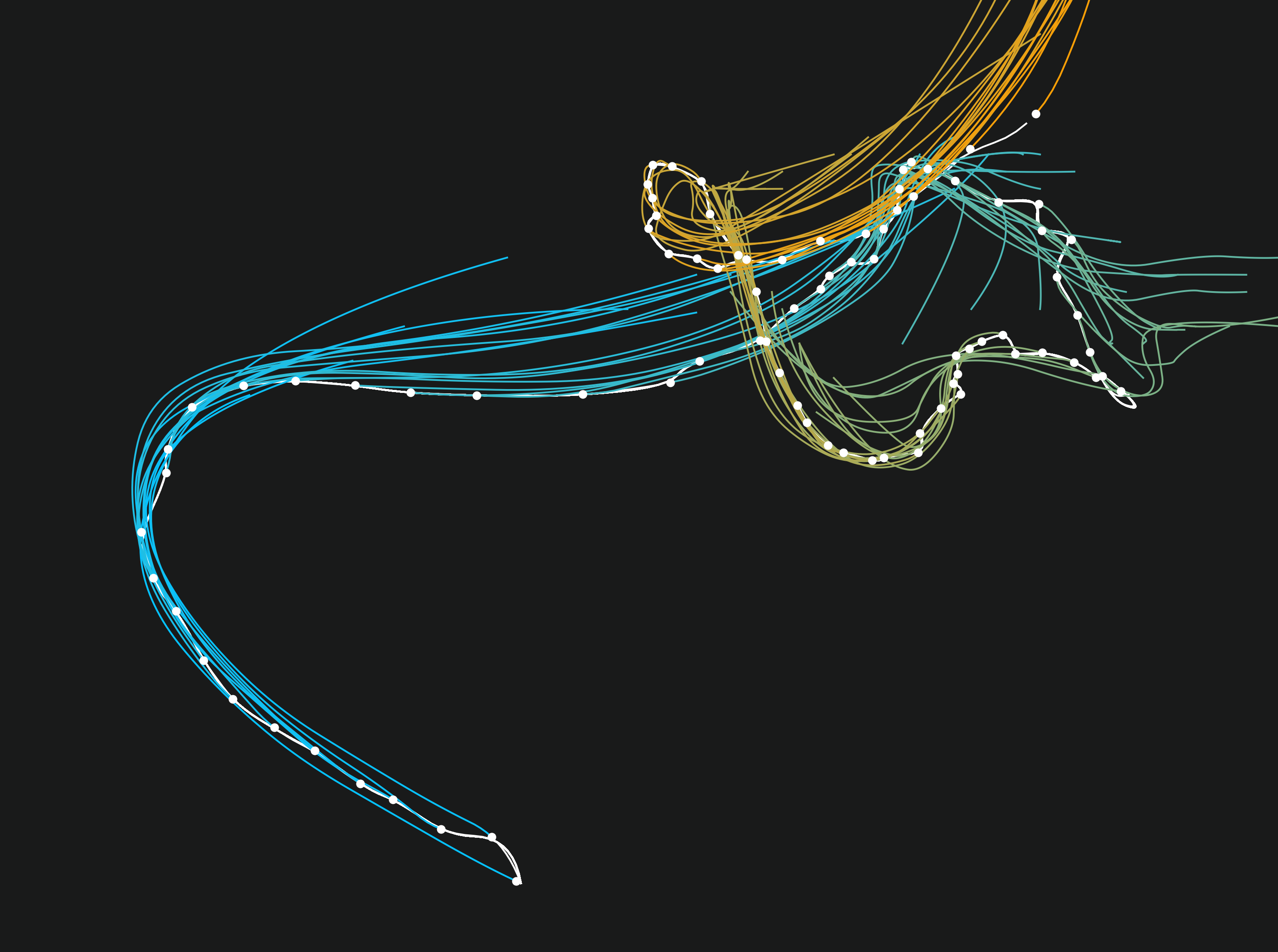
In 2005, hurricane Katrina's track was 31 advisories long, beginning northeast of Cuba, traveling westward to cross over the southern tip of Florida, entering the Gulf of Mexico, and then making a clockwise turn to head north through Louisiana and Mississippi. The left-half image "Forecasts of KATRINA 2005" shows the actual trajectory (white dots and line) and each of the 31 forecasts (colored lines). In the early part of the track, the storm was forecast to turn northwards soon after crossing into Florida such that it would make landfall again near Georgia. (These early forecasts are colored in a turquoise color.) As the storm progressed, suddenly many forecasts consistently pinned the storm very close to its actual future trajectory. (Colors of the later forecasts transition to orange.)
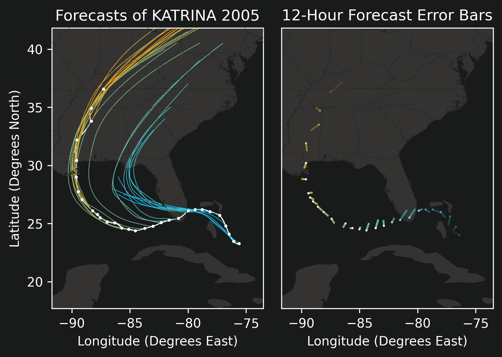
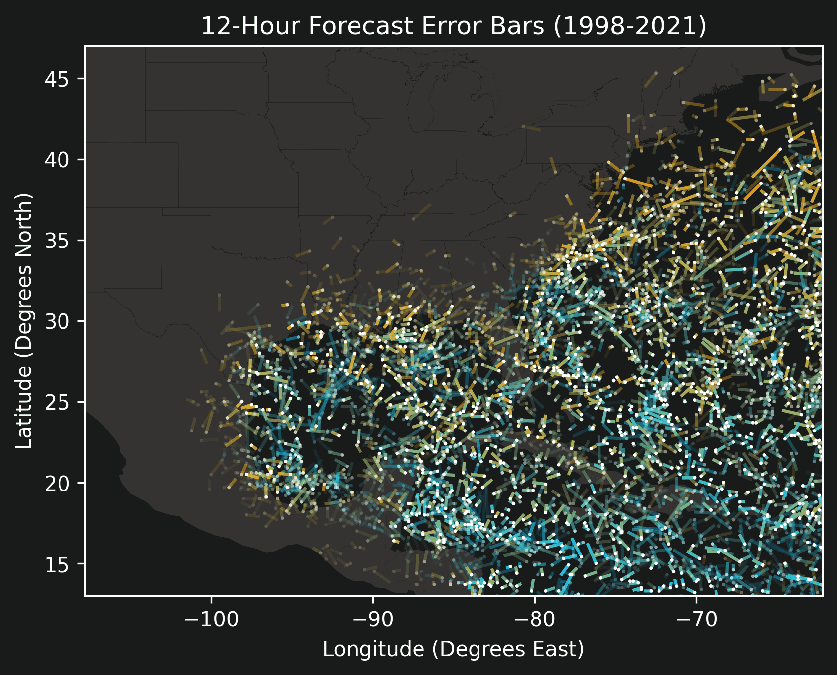
By using the actual track after-the-fact, we can assess the accuracy of all of the forecasts made throughout the lifespan of the storm. If on the 28th day of a month the NHC predicts that the storm will be at a specific location on the 30th day (48 hours in the future), we can measure the distance between its actual location on the 30th and compare it against that 48-hour predicted location. Drawing a line between the actual location and the predicted location gives an error bar that we can visualize on a map. Shorter bars mean better predictions.
The right half of the previous image shows Katrina's predictions' error bars for 12-hour, 24-hour, 36-hour, and 48-hour forecasts. As the duration of the forecast increases, the size of the error bars also increase. The white dots (in both the left half and the right half) represent actual positions, and so the other ends of the error bars depict where the storm was predicted to be located.
In order to quantify position errors, we compare the length of each error bar against forecast duration rather than showing the error bars on a map. The image titled "Forecast Position Error in KATRINA 2005" shows that comparison for Katrina. Like before, the turquoise to orange color gradient represents the point along the storm's lifespan at which a forecast was made. As expected all forecasts are fairly accurate at short durations and diverge more over longer durations. At a one-day forecast duration, all errors are within 1 degree (60 nautical miles). The white rectangles are histograms or violin plots whose sizes are proportional to the number of forecasts that fall within their error boundaries.
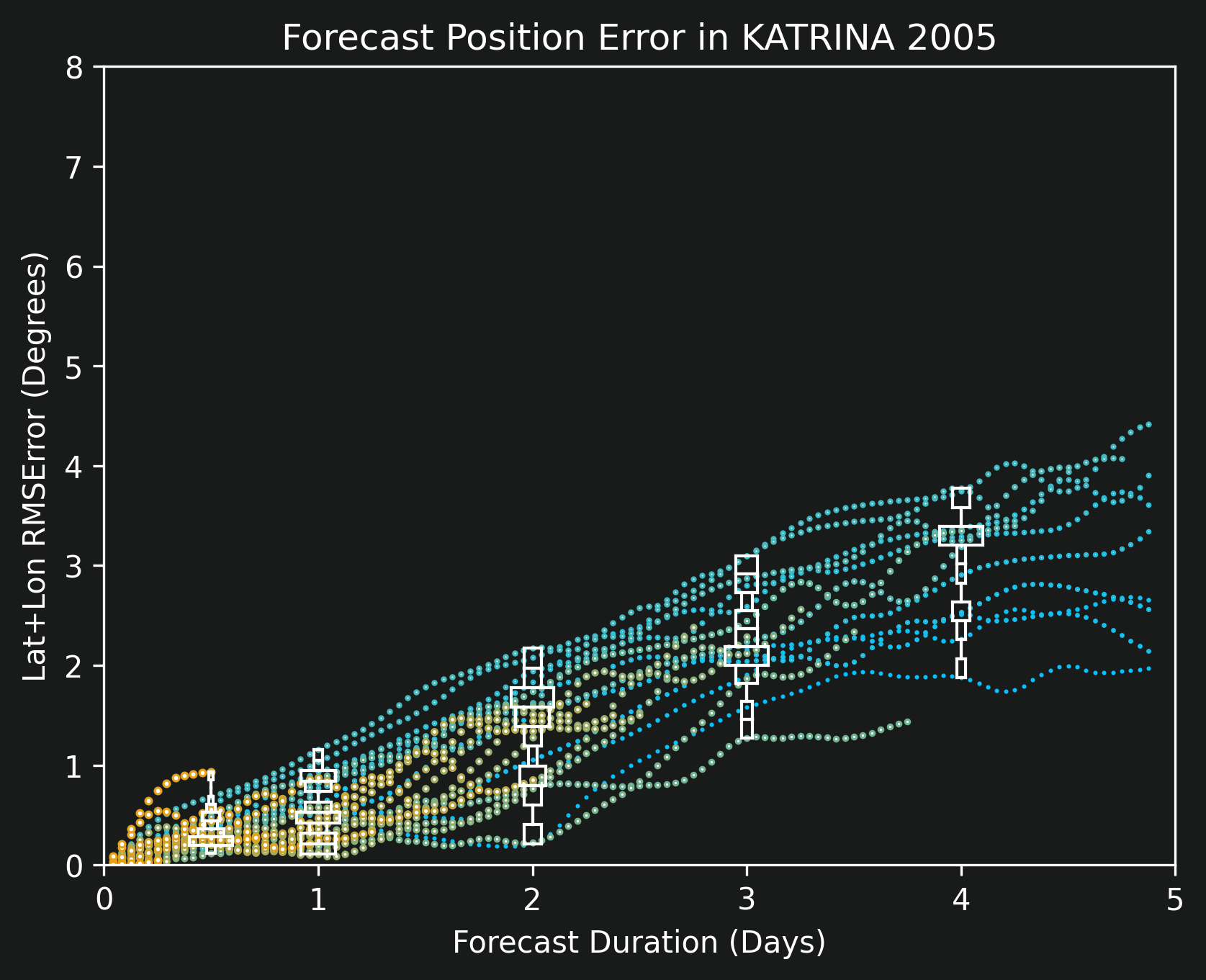
The map visualization and the scatter plot version have unique strengths. The map version gives a spatial representation and also shows whether the forecast was leading, lagging, or to the side of the actual trajectory. The scatter plot version cannot capture that, but instead it can show all forecast durations simultaneously, and the histogram / violin plot summary statistics are going to become very relevant in later plots when the visualizations contain more than a single storm.
We covered forecast tracks and positioning as well as how to quantify their accuracies in the previous section. There are two more pieces of information that are relevant in forecasts: the strength of the storm and its size.
The strength of a storm is provided as a single number that measures the maximum sustained wind speed. This number is used on the Saffir-Simpson scale to determine the "category" of a storm. A storm that has 90 kts sustained wind is classified as a Category 2 hurricane. One that measures below 64 kts is a tropical storm and is not considered a full hurricane. (That's not to say tropical storms cannot cause power outages!) Katrina's maximum sustained wind over water was around 150 kts, making it a Category 5 storm at that point.
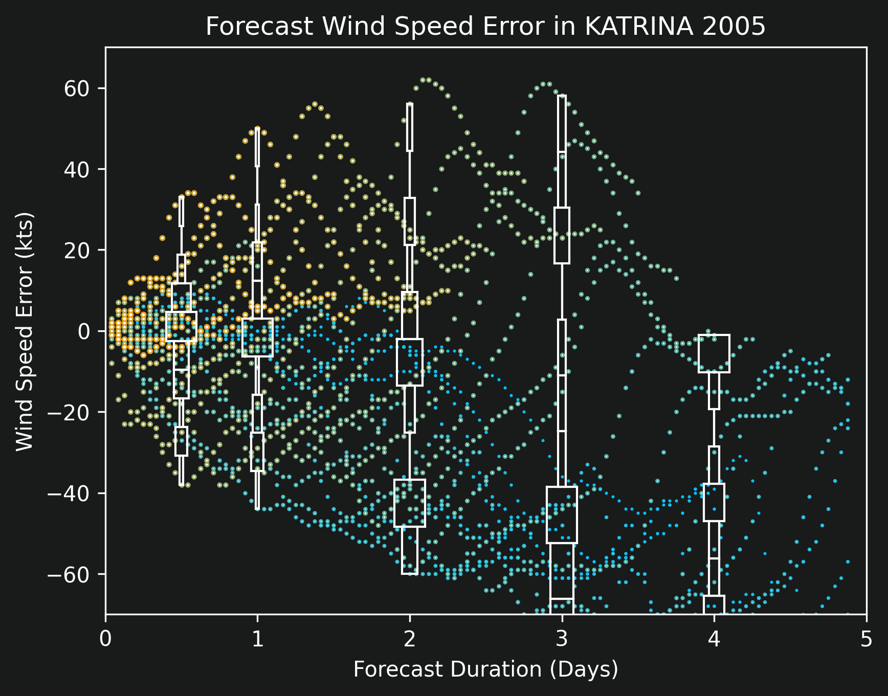
With every forecast advisory, the NHC provides predictions of maximum sustained wind. Using the same logic as before, we can calculate how accurate these predictions are by comparing the forecast values against what actually happened in hindsight. This scatter plot is shown for Katrina in the image titled "Forecast Wind Speed Error in KATRINA 2005". Again the x-axis shows forecast duration, and now the y-axis shows the error in wind speed. Note that unlike for position error in the previous section, this y-axis is centered at 0 and has both positive and negative values. Positive values mean that a storm was forecast to be stronger than it was in reality, and negative means that the forecast thought it would be weaker and that the storm strengthened unexpectedly.
The other metric that comes with forecast advisories is arguably the most important for predicting power outages: the size of the area that has sustained winds at 50 kts. This area is "roughly" circular and therefore its size can be quantified using its diameter. For example, Katrina at the brief instant when it was a Category 5 storm had a 50-kts diameter of about 200 nautical miles (or about 230 normal miles). For reference, the state of Louisiana is approximately 240 miles wide at its widest point.
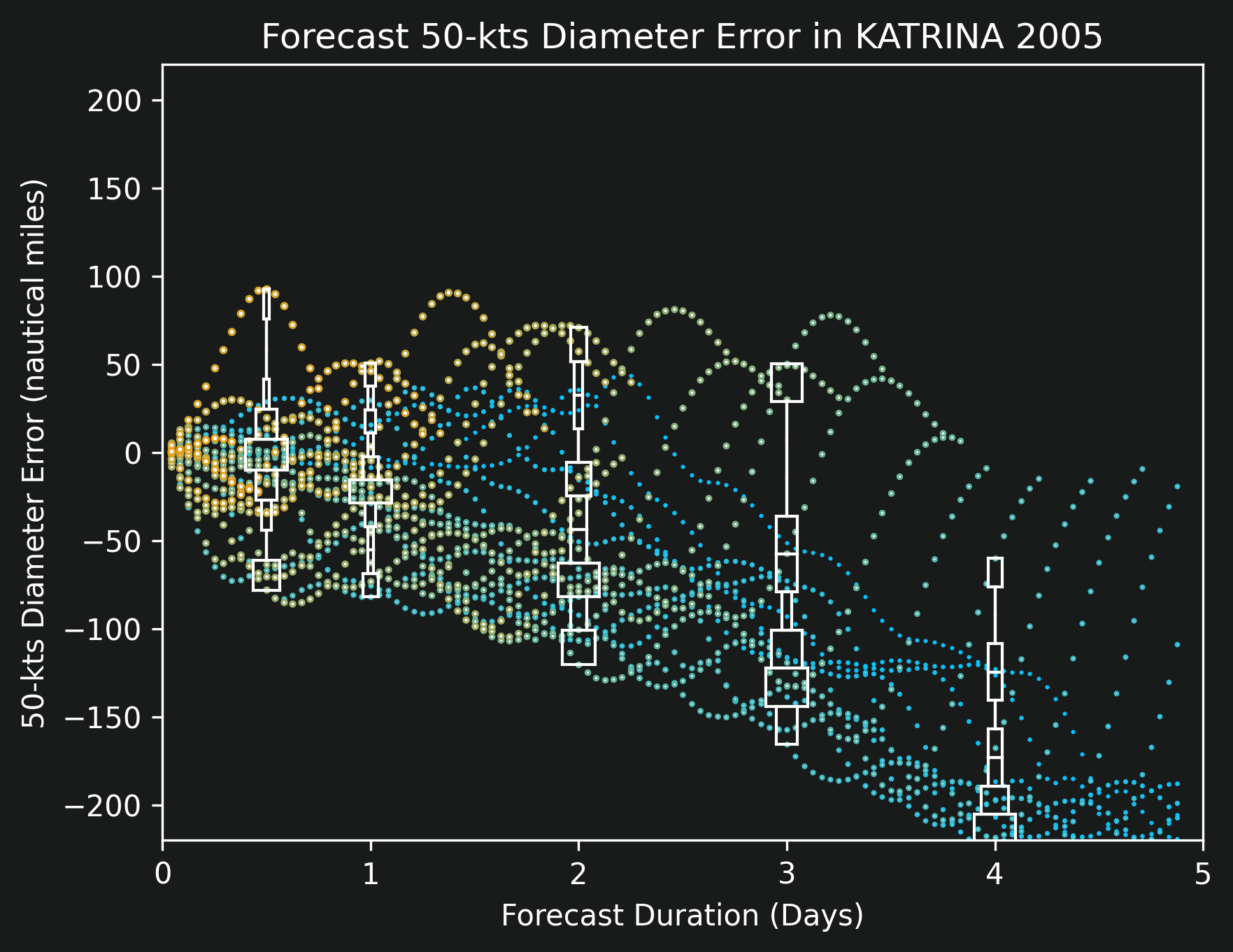
Just like with the previous two metrics, position and strength, we can quantify prediction accuracy for storm diameter. The scatter plot titled "Forecast 50-kts Diameter Error in KATRINA 2005" shows the visualization for Katrina. The x-axis again represents forecast duration, and the y-axis measures the error in diameter. Like with strength, the center of the y-axis is at zero and both positive and negative values surround it. Positive values mean that a storm was forecast to be physically larger than it ended up being in reality, and negative values mean that a storm was unexpectedly larger than foreseen.
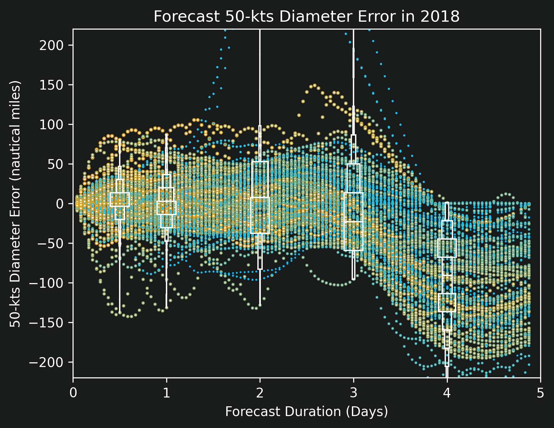
One interesting note that is not obvious from Katrina's visualizations is that diameter predictions are always "incorrect" in forecasts that are four or more days away. The image titled "Forecast 50-kts Diameter Error in 2018" captures the errors for all storms in the year 2018 and shows this trend more clearly. I suspect this consistent behavior is caused by the fact that there is no physical evidence from four days away that a storm will grow, but there are signs that a storm will shrink. (Going over land, for example, is known to dissipate a storm.)
We described three metrics in this article: position, strength, and size. And we looked at visualizations of all three for a single storm previously. This section presents those visualizations when capturing all storms from the year 1998 to the year 2021, excluding Ida and later storms this year (because of lack of internet at the time of writing).
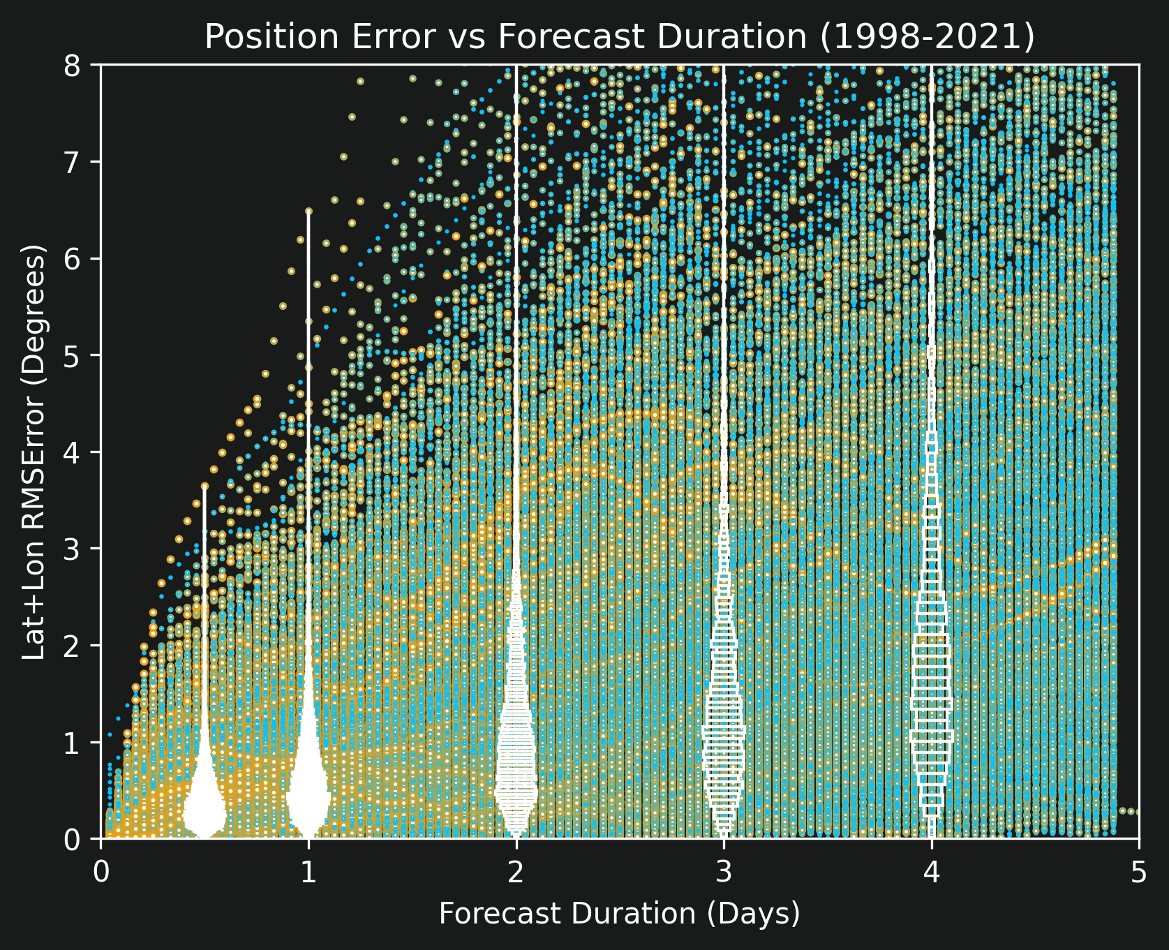
The image titled "Position Error vs Forecast Duration (1998-2021)" captures position errors. The most important piece of information contained in that visualization comes from the violin plots that provide summary statistics at various forecast durations. The ones at 0.5 days, 1 day, and 2 days are especially relevant. From 12 hours away, most forecasts are accurate to within about 0.25 degrees (15 nautical miles) as can be seen by the widest part of the violin. At 1 full day away, the most likely error increases slightly closer to 0.5 degrees. At two days away, most predictions are accurate to within about 1 degree, but the tail is starting to thicken indicating that there is a lot of uncertainty.
To provide a little more context to position errors, examine this animated map that shows error bars for 12-hour, 24-hour, 36-hour, and 48-hour predictions of all storms. These plots look incredibly chaotic with no discernible pattern -- this is good because it means that the NHC uses all available information in its predictions and does not have any systematic errors. The only visible pattern is an expected one: most storms are orange colored on land, with orange signifying measurements taken near the end of a storm's lifespan, meaning that storms dissipate when not over water.
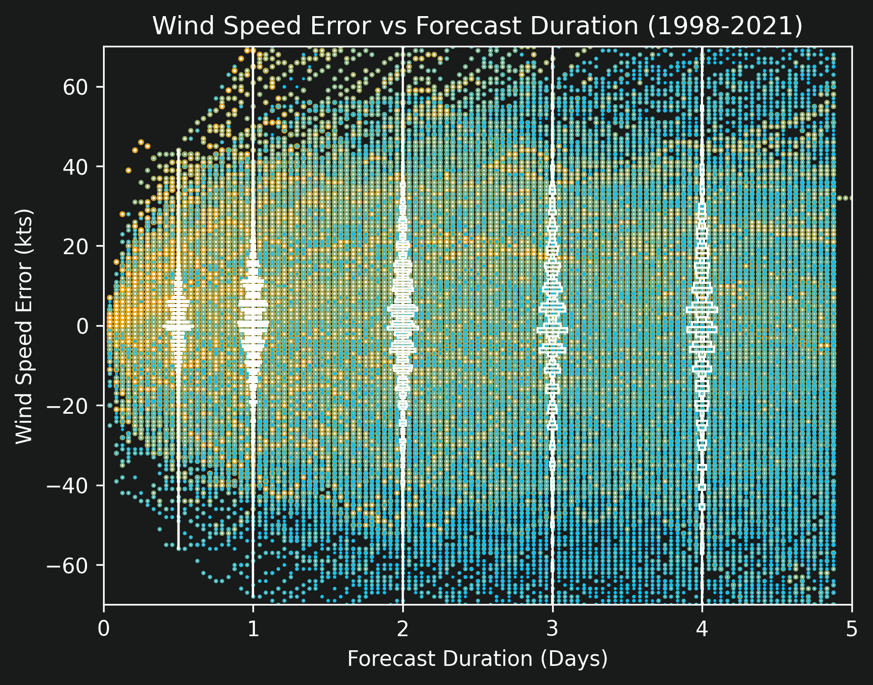
Forecast errors of historical storms' strengths are shown in "Wind Speed Error vs Forecast Duration (1998-2021)", and errors of historical storms' sizes in "Forecast 50-kts Diameter Error (1998-2021)", both of which display so many data points that reliance on the histograms is mandatory. The wind speed error plot shows that at 0.5 days, almost all forecasts are within plus or minus about 10 kts, meaning that it is unusual for a storm's "category" to be predicted incorrectly. At 1 full day, the spread is wider, and a 20 kts discrepancy could easily result in a Category 2 storm being classified as a Category 3 or vice versa. At 2 days, the spread is slightly wider still. Other than the actual error distribution, the only interesting item of note here is that the histograms look "wavy" -- this is due to quantization caused by the NHC rounding wind speeds to the nearest 5 or so kts. There are never measurements or predictions of wind speed that show 128.7 kts, always that gets rounded to 125 or 130.
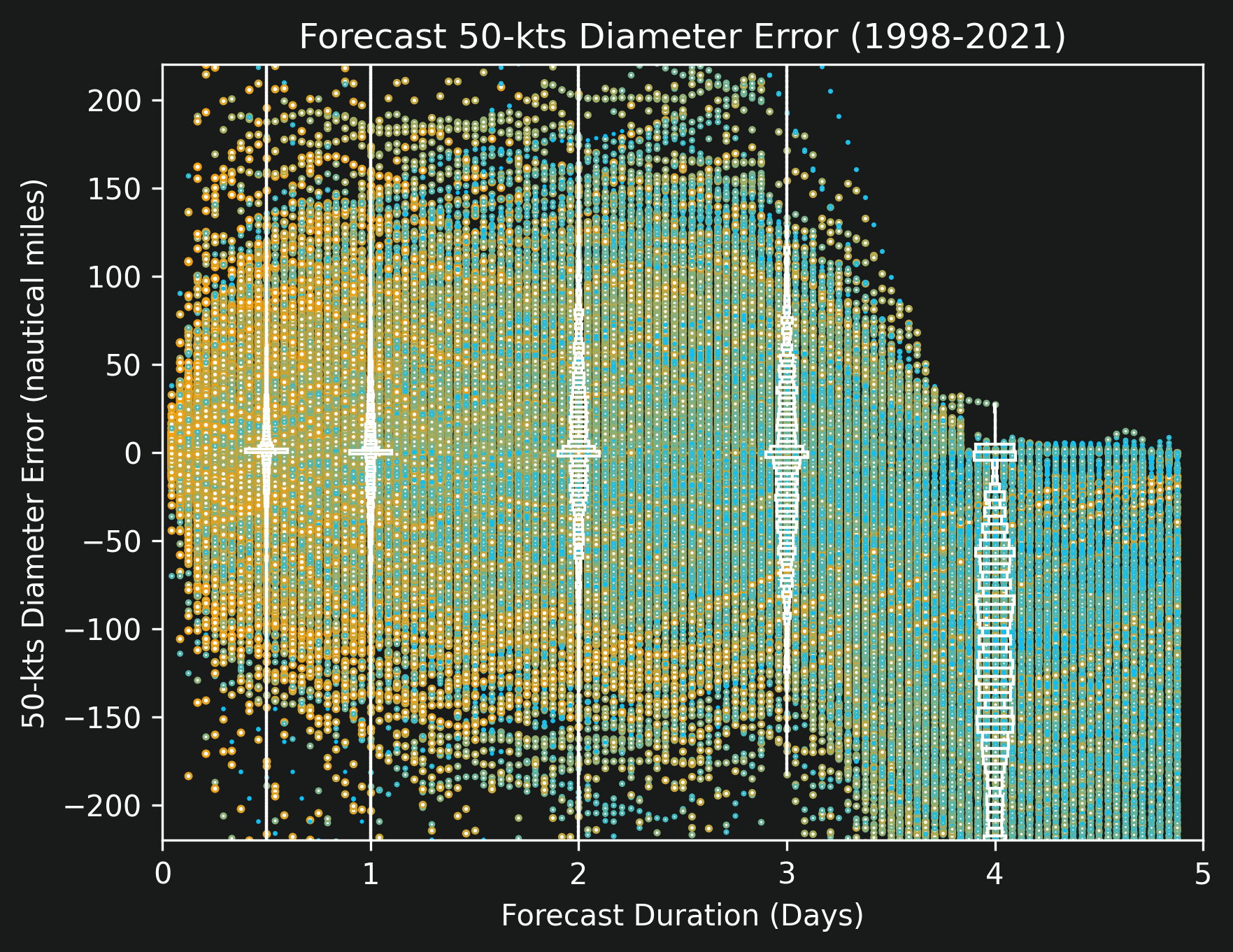
The diameter errors are surprising in their accuracy. Even though there are so many data points, the histograms are almost entirely concentrated around zero, implying that on average the diameter predictions have incredibly low prediction errors. Further analysis is necessary, but this might be due to the fact that a storm's diameter cannot change quickly, meaning that short-term forecasts can be confident that the size of the storm will remain constant.
On average the NHC's forecasts are very good, but there still are some prediction errors that should be accommodated for when making outage predictions using HurrD and its "what-if" scenarios. This image of Ida shows the forecast trajectory, size, and wind speeds 36 hours in advance. (On the left panel, the latest advisory is from 10am on the 28th, but the screenshot depicts the storm as it would be seen at 11pm on the 29th.) Based on the error analysis performed thus far in this article, this trajectory is expected to change, and in fact watching the updates in real time leading up to Ida's landfall did show that the track shifted about 0.5 degrees east.
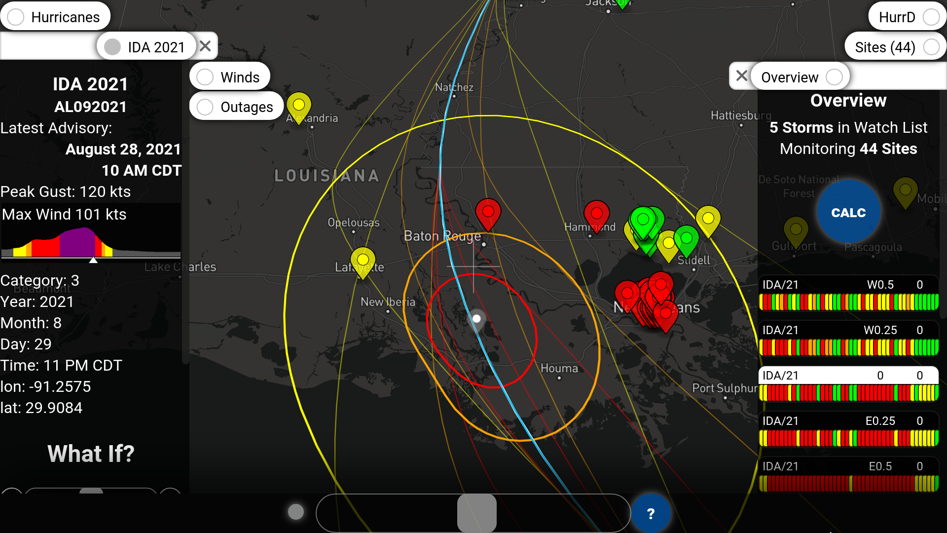
The far right side of the screenshot shows the Overview panel that summarizes five storms. More precisely, it summarizes a single storm but under five separate what-if scenarios. Those scenarios are, from top to bottom, Ida shifted west 0.5 degrees, west 0.25 degrees, the best projection with no shifts, shifted east 0.25 degrees, and shifted east 0.5 degrees. There is one colored pip in the Overview panel for each site and each storm. For the set of sites selected (with a heavy focus on New Orleans, as displayed on the map), the storm diverging westward would result in less red, and the storm moving eastward would result in more red.
HurrD's ability to shift storms east-west and also north-south provides a direct way of accounting for position uncertainty, but it also indirectly handles strength and size uncertainty. Simulating a what-if scenario in which the storm is stronger is largely equivalent to shifting the storm's trajectory inland. Since storms are known to start weakening as soon as they make landfall, virtually shifting that point farther over land would have the net effect of simulating a stronger strike at any point on land. Similarly, simulating a what-if scenario in which the storm is larger or smaller is equivalent to shifting the storm closer or farther from any sites of interest.
This article analyzed three types of errors in hurricane forecasts: position error, strength error, and size error. All three were visualized for a single storm in order to give insight into the numbers, and then all were summarized over the entire collection of storms from 1998 to 2021. The quick takeaway is that for a 24-hour prediction, position errors are on the order of 0.5 degrees, strength errors on the order of about 20 kts, and size errors are negligibly small.
All three types of errors can be easily accounted for using HurrD's what-if scenarios, and a quick example was provided for a 36-hour forecast on hurricane Ida. A future article will likely perform an in-depth analysis of the forecasts leading up to Ida's eventual landfall.
----------
This article originally appeared at https://unocity.us/blog/quantifying-accuracy-in-hurricane-forecasts on September 6, 2021.
Visit https://hurrd.ai for more details on HurrD and https://unocity.us to see Unocity's main website.
