Rastin Rastgoufard, Ph.D.
Unocity Innovations Inc
July 30, 2021
Here in New Orleans, we're very familiar with hurricanes. In the past 20ish years, the Atlantic Ocean has seen *400* tropical storms and hurricanes. They arrive seasonally, and while we're technically in hurricane season right now, the worst of the season is just ahead of us.
In this article, we want to provide a little statistical analysis on the past 20 years of storms, evaluate a couple of very simple predictive features, and talk about the difficulty of relying solely on historical statistical data for making decisions about hurricanes.
Four hundred giant storms. Here they are on a timeline. (We colloquially use the terms hurricane, storm, and tropical storm interchangeably.) Each storm is depicted as a vertical white rectangle. The lowest part of the rectangle corresponds to the start time of that specific storm, and the highest part corresponds to the end time. That means the height of each rectangle is proportional to the duration of the storm. Each year is grouped together (see the x-axis on the bottom), and the total number of hurricanes in each year is written as the number above each year's grouped column. The year of Katrina, 2005, had 30 storms. As of July 2021, we have had five storms in this season. Some years were quite light on storms. 2006, for example, had only nine. The typical year seems to have around 16 or 17.
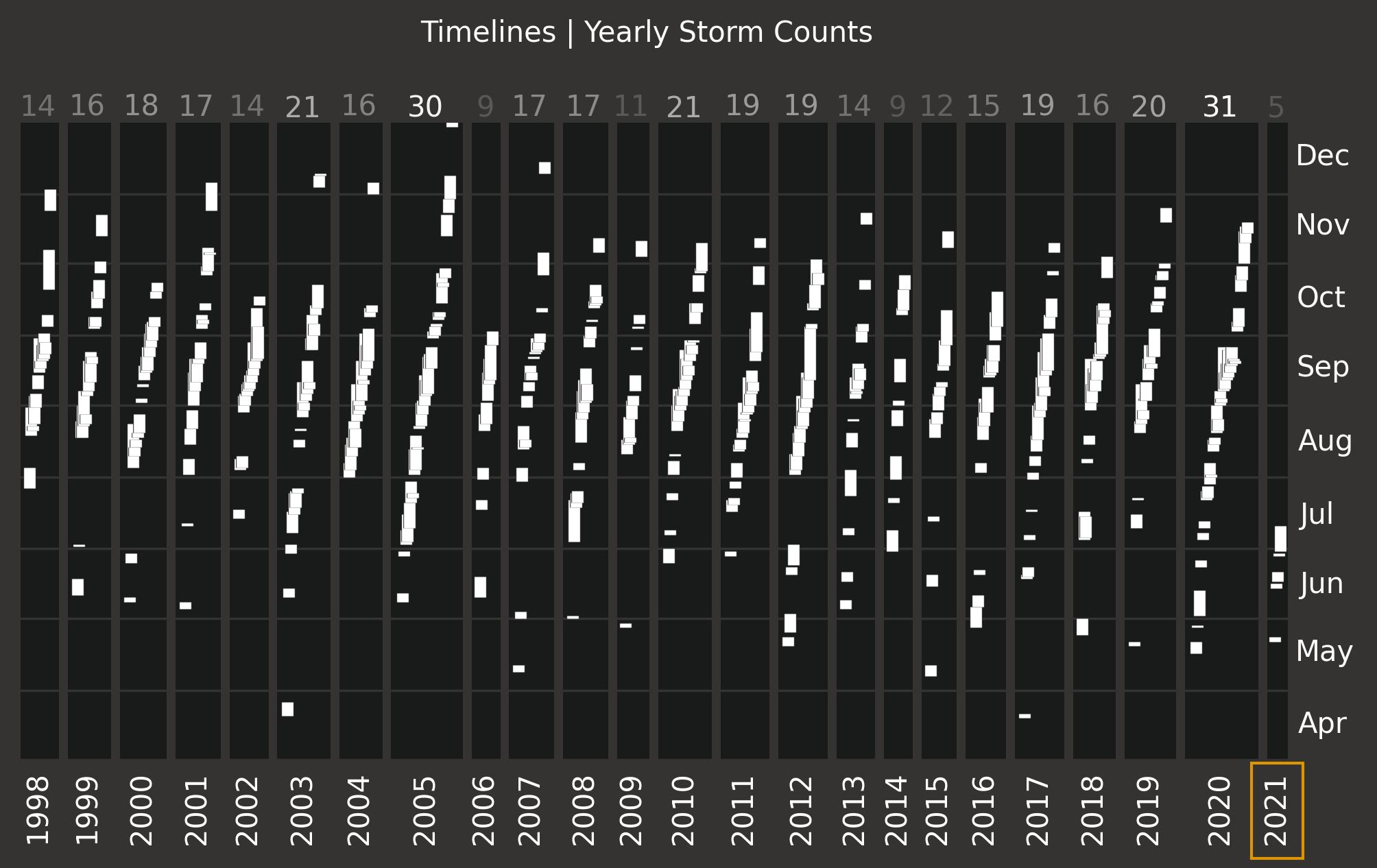
This visualization leads to two obvious follow-up questions: 1) What does the daily distribution look like when marginalized over year? 2) Is there a pattern to the number of storms in a given year? We'll discuss the first question here before moving on to the second question in the next section.
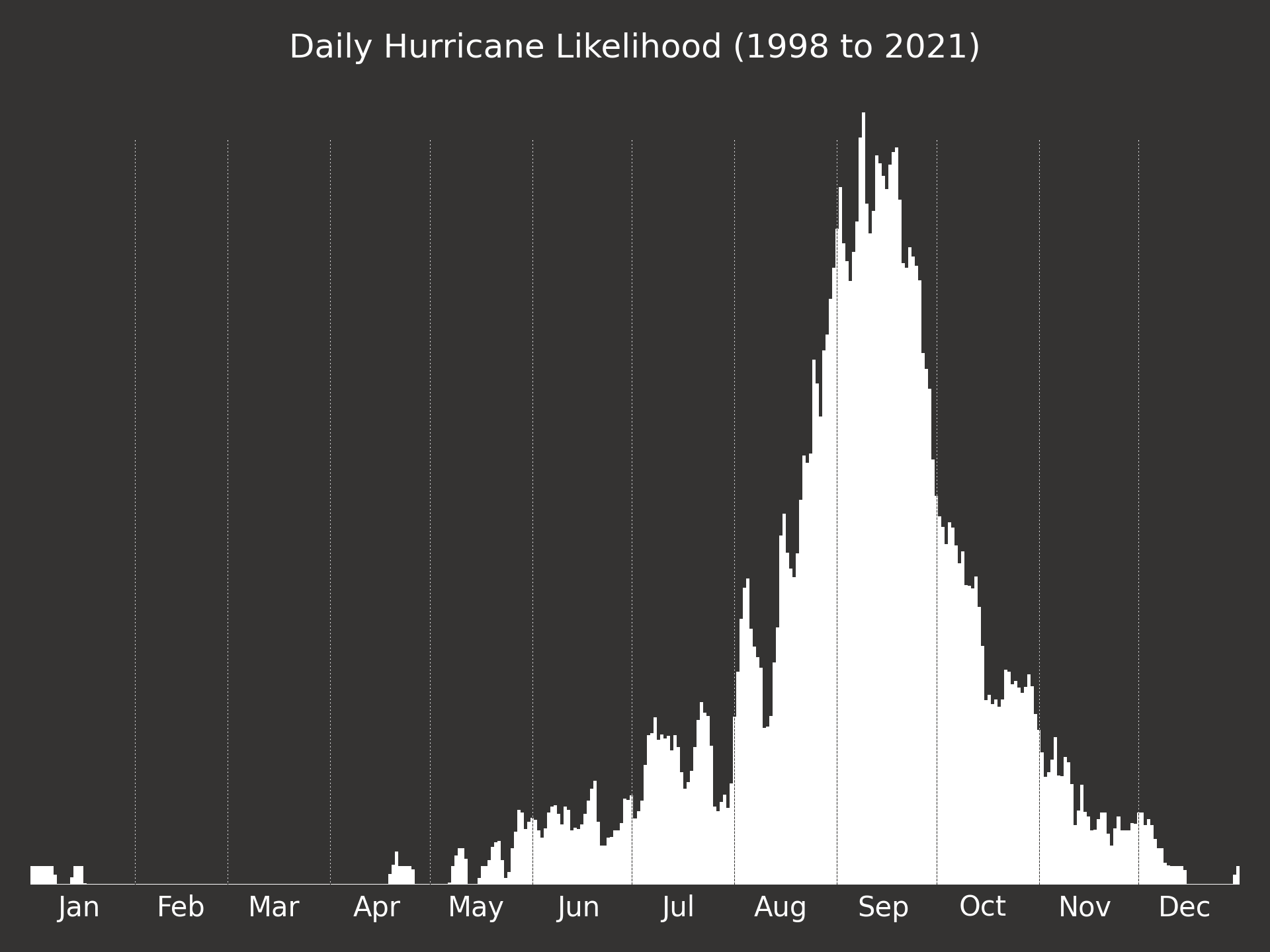
The daily distribution makes it immediately apparent that September is the month to worry about most. Then August and October, the two months adjacent to September. Of the 400 storms since 1998, 80 of them are August storms, 133 in September, and 81 in October. Those three months together account for about 75%.
Wouldn't it be great if there were a way to predict how many storms a year will have? It's unfortunately not very predictable, but let's examine a couple of simple features to give us some rules of thumb. Consider this new timeline image which like before represents each storm as a vertical rectangle, but unlike before years are sorted according to the total number of storms in that year, and the fifth storm of every year has been colored orange.
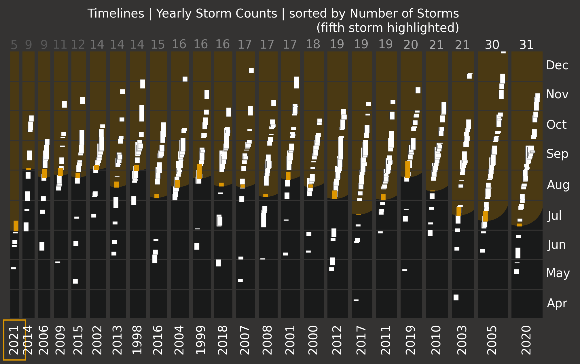
It's interesting that 2005 and 2020 have so many more storms compared to other years. Both seem to have been outlier years whereas almost nearly every other year has had between 15 to 20 storms.
Also interesting is a general sense that there is a tiny correlation between the timing of the fifth storm and the number of storms in that year. Following the orange rectangles, there is a slight downward shift going from left to right (fewer storms to more storms), where downward in this case means earlier in the year.
Another way of examining that tiny correlation is by plotting it directly. Here's a scatter plot of the start date of the fifth storm against the number of storms in a given year. Each orange dot represents a single year (with the most recent few years being textually labeled too). The blue line is the line of best fit through the data points excluding this year.
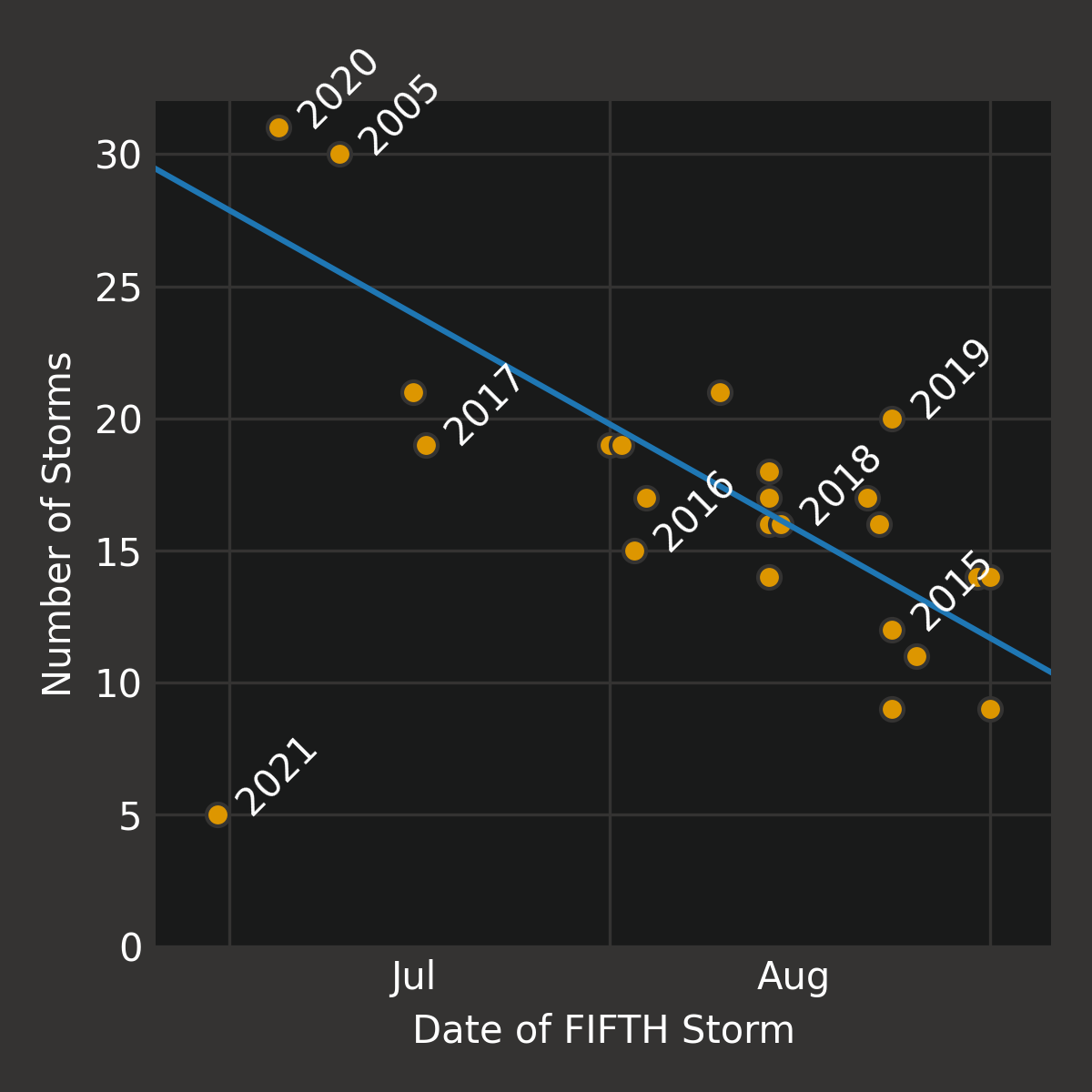
The plot shows visually that there is a correlation with error deviations no more than about 5 storms. According to the best fit line, 2005 and 2020 would have been predicted to have about 26 or 27 storms, 2018 was almost exactly as predicted, and both 2016 and 2017 were below their predictions. The biggest error in the prediction is from the year 2019 that was predicted to have 14 storms but in reality had 20.
The best fit line and predictions so far have been based on using the timing of the *fifth* storm in a given year as a predictive feature. Why specifically the fifth storm? The following tiled image shows the scatterplots and associated best fit lines for the second, third, ..., up to ninth storm. There is a clear tightening of the correlation as the number increases.
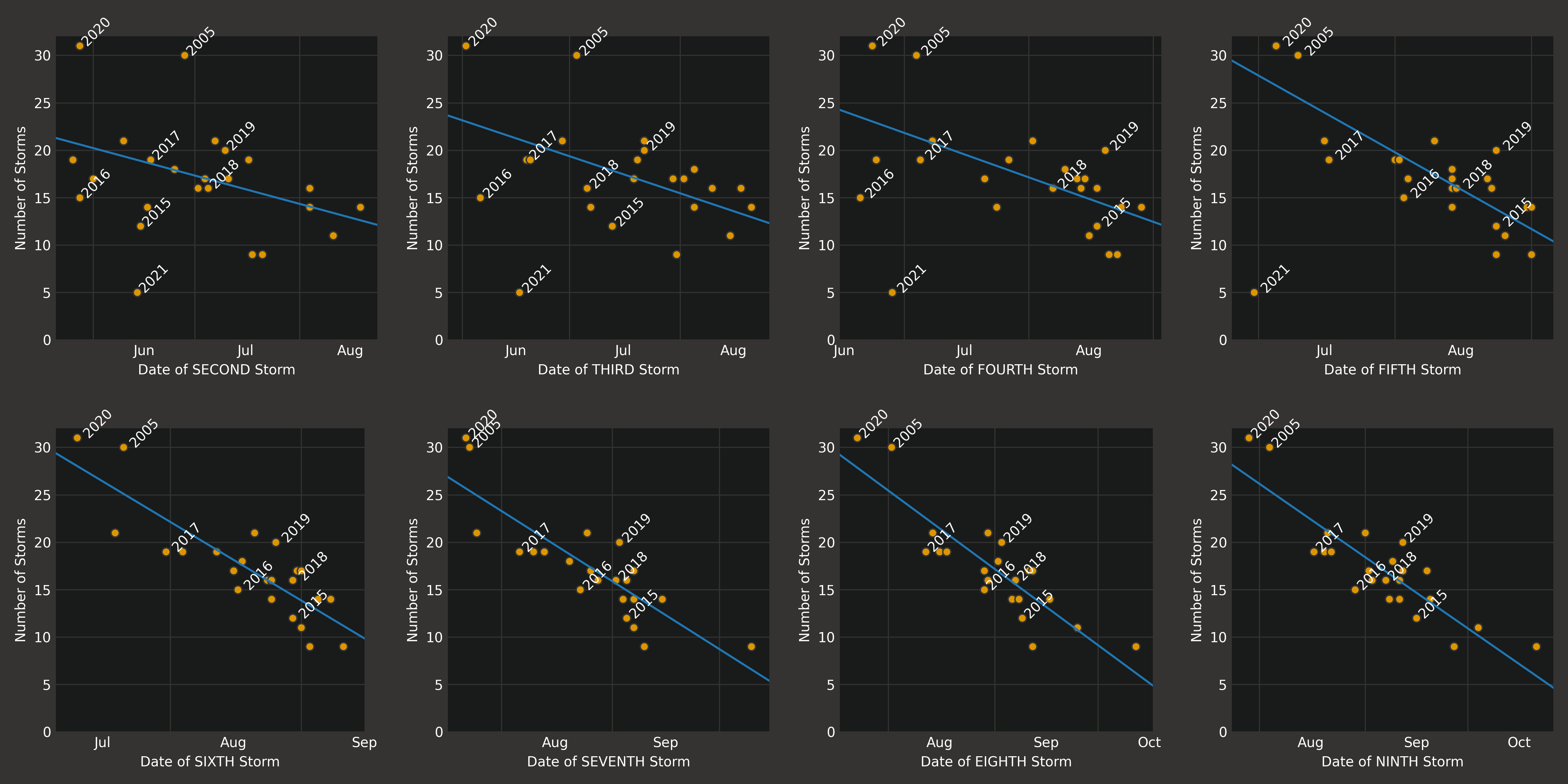
As of the time of this writing, 2021 has had five storms, so using the fifth storm would make sense for this year. Using the sixth, seventh, eighth, or ninth storm of the year is not applicable to 2021 since we haven't yet had those storms. Ideally, a good predictive feature would use a small-numbered storm so that the prediction can be made as early as possible. Predictions are not so useful if they are late.
In any case, neither five, six, nor seven are bad choices for a predictive feature. Seven is probably too late in the year to be of any use, so either five or six is probably the best for quick estimations.
According to the best fit lines using the fifth storm, this year is predicted to have a whopping 30 storms, putting it on par with the worst years we've ever seen! On the other hand, because the sixth storm has not yet arrived, it is fairly unlikely that this year will have more than 20 storms.
Statistical timing information might be useful, but what do these storms actually look like? How do they behave? For our purposes, a hurricane at any given time instant has a center and a set of winds around that center. The center moves as the storm progresses, and the winds fluctuate as well. For strong storms, wind speeds can get very high, into the neighborhood of 140 kts (160 mph or 260 kph).
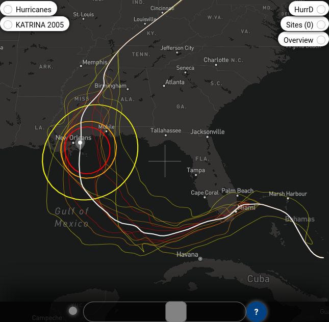
One way to view a storm is taken from the application HurrD. This visualization of 2005's Katrina shows three colored rings indicating wind speed contours (yellow is 34kts, orange is 50kts, and red is 64kts) at a specific instant of time (approximately at landfall), a heavy white line showing the track of the storm, and thin colored lines showing the extents of the wind contours over time. HurrD has a draggable slider at the bottom of the interface that allows you to interactively scrub through time to see the evolution of the storm.
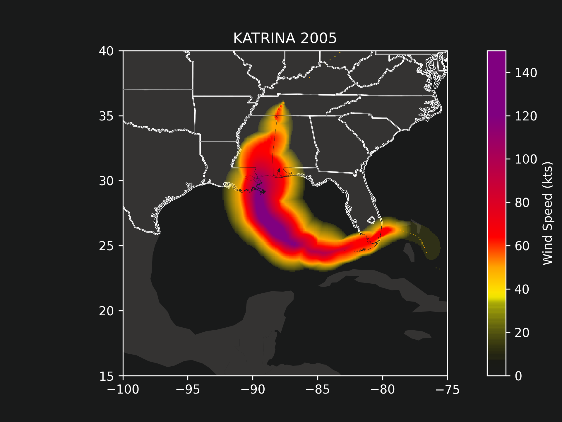
Another possible visualization of a hurricane is to stack all time instants onto a single plot and depict on a geographical map the maximum wind speeds seen everywhere in the area. The following picture shows exactly such a plot again for hurricane Katrina in 2005. This was a strong hurricane causing wind speeds upwards of 120 kts just east of New Orleans. Can you imagine traveling in a car at 140 miles per hour *and then rolling down the windows*?
(New Orleans flooded heavily because of levee breaks during Katrina. But if the storm's path took it even 15-30 miles west of where it actually hit, it is entirely possible that New Orleans would have literally blown away, causing significantly more damage than what happened that year.)
If we give the same treatment to all storms in 2005, we will obtain the following image.
In fact, we can obtain one such image for each year. The following tiles show the collective maximum wind speeds for each year between 1998 and 2021. (This is a high resolution image. Feel free to zoom in.)
From a bird's eye view of the tiles, it's immediately obvious that 2005 was a stand-out year. There were many storms, several of them were expansive, and a number of them had extremely high wind speeds. 2020 also was a rough year, especially for western Louisiana where two focused storms made landfall at precisely the same location.
It might be interesting to plot all of the storms' tracks simultaneously. The following image shows 400 tracks focusing on the Gulf of Mexico region and also zoomed out to view the entire Atlantic Ocean. The track lines are colored by the maximum wind speed of the storm at any point along its trajectory. Unfortunately, the plots are a little too spaghetti to result in any meaningful takeaways other than the fact that there are _a lot_ of storms.
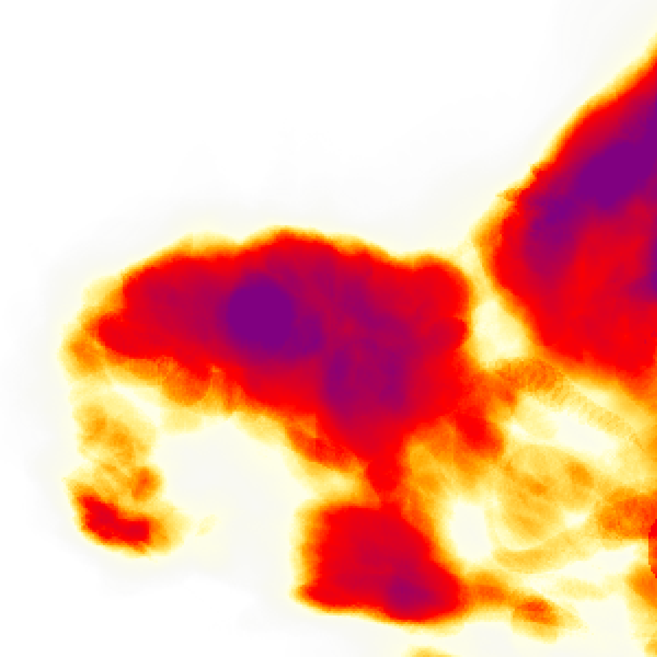
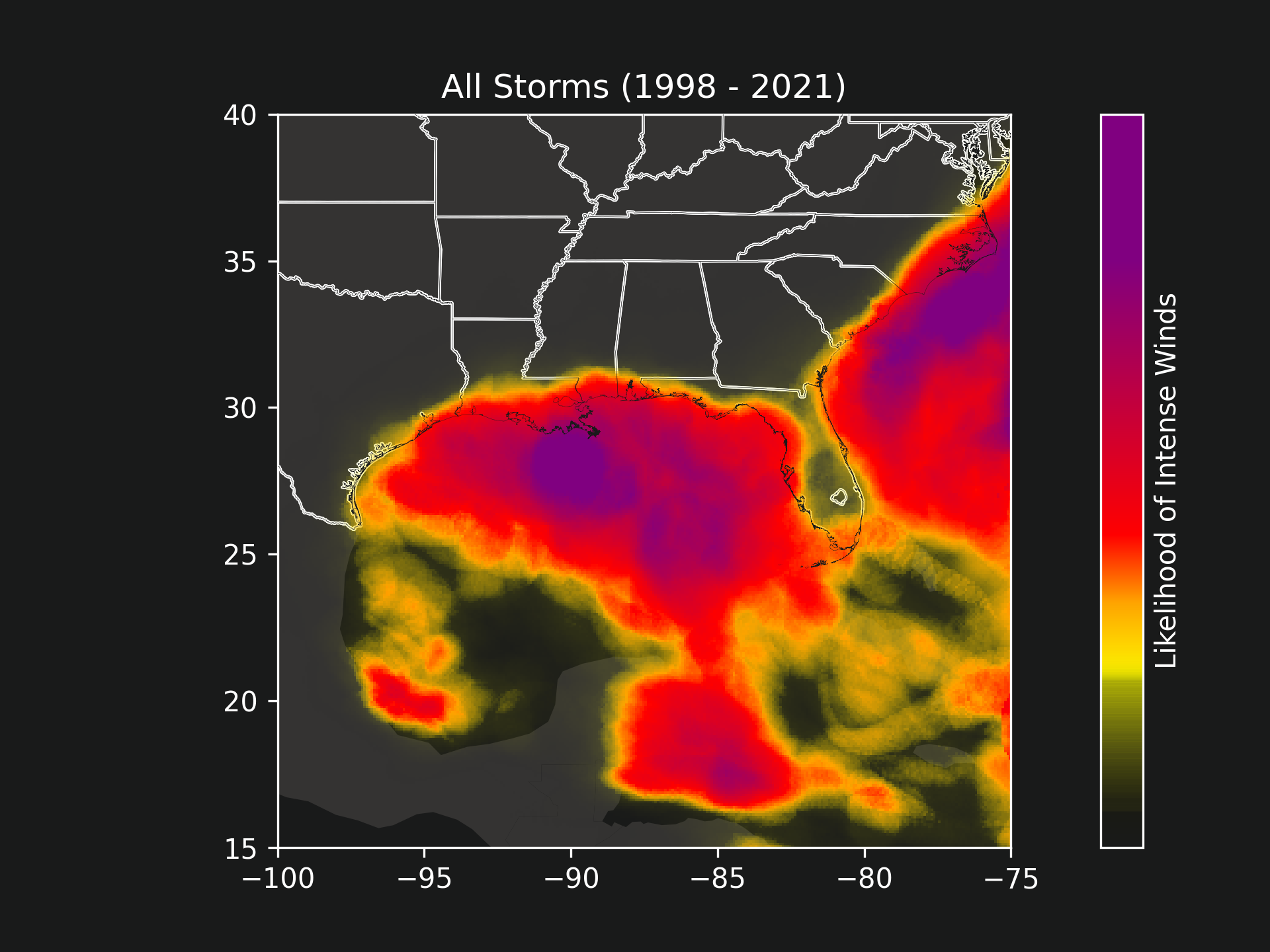
A more productive visualization is to find the likelihood of intense winds at any location. This is accomplished by "summing" all of the wind fields together and then normalizing. Note that previously we examined the "maximum" wind speed at any location, but now we will obtains something akin to the average wind speed taken over all 400 storms. The following two images depict these likelihoods for the entire Atlantic Ocean region and then more focused on the Gulf Coast region.
Several aspects of these likelihood visualizations are interesting.
First, as a local New Orleanian, the massive purple blotch just south of the tip of Louisiana comes as no surprise. We get a lot of hurricanes here.
Second, the amount of land penetrated by intense winds Louisiana seems much larger than I would have expected. Texas, Mississippi, and Alabama all receive winds too, but primarily on their most coastal regions. The west side of Florida, specifically the Tampa area, also seems to receive a lot more winds than I expected.
Third, completely contrasting the previous point, I am quite surprised at how little wind mainland Florida receives on average. Note that this does not mean Florida is immune to storms. (See the spaghetti plots from before to verify that many storms pass straight over mainland Florida.) What it does mean though is that out of the 400 storms since 1998, intense storms do not seem to linger on mainland Florida the same way they do just south of Louisiana.
Fourth, I had no idea North Carolina's east side gets so many storms so consistently. We feel for you.
Hopefully you have a fairly good overview of storms and hurricanes based on this article, so what can we do with this knowledge? Unfortunately, knowing the statistics and historical data, while interesting, does not help us take immediate actions.
Ideally, we would like to take preemptive action, a way of taking future hurricane forecasts and predictions and acting on those. Weather stations and the National Hurricane Center provide real time storm coverage and also make storm trajectory predictions up to five days in advance. Obviously, if a major storm is coming near our cities, we take appropriate measures. But what does it mean for a storm to be "near" a city?
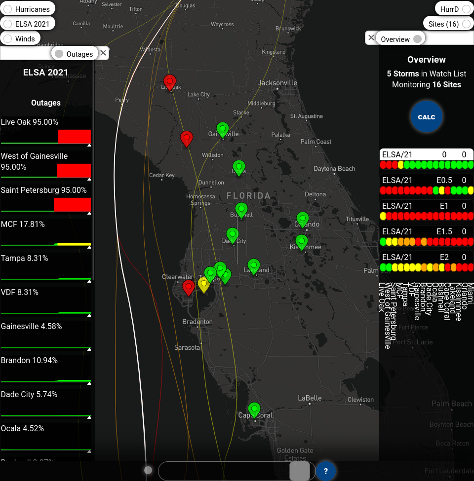
The application HurrD gives a concrete, quantifiable number that provides a baseline measure of how severe a storm is to any location. It merges hurricane information with the national electrical power grid to make predictions on which transmission lines will be impacted by a given storm, and then uses that to calculate the probability that a specific location will lose electricity.
HurrD will be the focus of the next article. But for now, here is a screenshot from its outage predictions for Tampa during this year's fifth storm Elsa.
----------
This article originally appeared at https://unocity.us/blog/statistical-comments-on-hurricanes on July 30, 2021.
Visit https://hurrd.ai for more details on HurrD and https://unocity.us to see Unocity's main website.
